Over the last few weeks, we’ve received more detail and news about the pending migration process. Here are a few of the highlights:
Training scheduled for site administrators
Senior campus website administrators are to receive training in the new Cascade CMS system over the next while. This will assist with getting existing Sitecore content ready for the migration. In ALES, our content is in good shape, and this training will help us further understand the abilities and limitations of the new system.
ALES-managed Centre on track for migration
The Centre for Health and Nutrition website, managed and maintained by the ALES Web team, is currently in the queue for migration. It’s one of the early migrations as it’s directly under the top-level navigation that is scheduled for the first wave of migration. Faculties and other large units will be slated to move after the top-level navigation migration is complete.
The ALES Web team is using this opportunity to monitor the migration process for potential issues that would impact the Faculty migration.
Increasing awareness for ‘Mobile-First’ content design and layout
Central has reiterated their position that all content should be created and laid out so that it is mobile friendly. This is a ‘Mobile-First’ philosophy that has repeatedly been born out in numerous website and visitor analytic reviews.
From the university Web Style Guide:
Responsive Design – Mobile First Content
-
- Prioritize content for mobile viewing (most important at top to least on bottom)
- Avoid awkwardly shaped images (extremely wide or tall images will shrink to hard to view sizes on mobile)
- Take advantage of the grid system, which has predefined behaviours for each device
- Test your websites on different devices and different resolutions to make sure the page does not “break” at any point
- Read more about mobile first design
From a design perspective, basically, it means that the site should be designed to look good and be readable on a phone/tablet first. If it meets that test, then it’ll look good on a desktop.
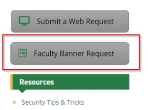
The ALES Web team agrees with this position and is developing tools that will assist in the creation of content that is mobile friendly. The first is the ALES Faculty Banner Request form – which includes a one-page specification sheet detailing the CURRENT requirements for a banner to appear on the ALES home page. These requirements will change once the migration to Cascade is complete.
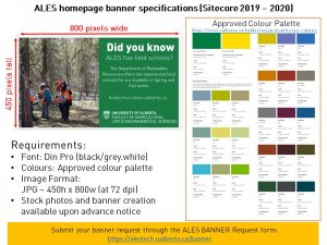
You can access the Banner Request form by the button on the ALESTech website.
As we complete other tools and guides, they’ll be posted here and on the ALES Website page on the faculty Intranet.